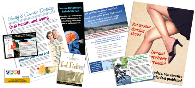
A few of the logos I’ve designed over the years…
Perhaps one of the most difficult things for a business owner to do is decide on a logo. I’ve seen many a client agonize over this process, but it doesn’t have to be difficult. You just need to find a professional designer you trust and be open to their advice. Sadly, that doesn’t always happen. Here’s a great illustration of that.
 The client’s company name was Mortgage In Minutes, Inc. The owner came to us with a logo concept already in mind. He wanted a Minuteman as the main image. Well, if you’re a history buff, you probably know what a “Minuteman” is, but would you recognize and connect a logo with that concept? Plus, with today’s sad state of education, how many prospective customers would even know what a Minuteman is, much less recognize one? My policy with logo design is to always give the client at least three different concepts to consider, so I created two concepts with a Minuteman theme, but a third one entirely different (see the image at right) — a modern, stylized logo that did a better job of communicating the business’s product/service. Despite my advice, the client wanted to stick with his original idea and chose one of the Minuteman concepts. Since ultimately I give a client what he wants, that’s what I did, but I still prefer this concept.
 I mentioned in my intro article on Logo Design that, basically, size matters. This next logo does a good job of illustrating that. The client owns a small publishing firm, Red Sage Publishing, and the logo was going to be going on rather narrow paperback book spines. That’s an even smaller space than what may go on a business card. The client’s target market are women, so she wanted something that was very feminine. And in the beginning, since her book covers were being printed in a single ink color, the logo needed to work well in a single color as well. I opted for a monogram, using just the RS of the company’s name, and set it in the elegant Vivaldi typeface. I allowed the letter forms to extend outside the “box” as well as overlap each other, reversing the colors where that happened. The client was thrilled with the end result and it looks great on her book spines, but also holds up well when used at larger sizes.
 There are times when a logo needs to be freshened up a bit. For instance, some very well know logos have undergone changes over time, like Betty Crocker and Quaker Oats. It’s often done to keep the logo current, but sometimes a logo needs a complete overhaul. A terrific example of this is the logo for Precision Marketing and Client Communications. Initially, this company was a client of mine (I did the layout work for their newsletters). Their logo was terrible, but there wasn’t anything I could do about it until I bought the company. Then one of my first actions was to redesign the logo. In this image, you see the smaller logo with the periscope-type target symbol the company originally used, then the larger, bolder revised logo I created. Instead of the target symbol, I used a printer’s registration mark, which fits better with the company’s products. Because the company name is so long, I made the word “Precision” the focal point, setting it in a personal favorite typeface, Rowdy Heavy, but replacing the “O” with the registration mark. Then I set the balance of the name in Tekton, reinforcing that concept of “precision”.
While logos can benefit from the occasional update, don’t get carried away. I’ve seen companies frequently changing their logo, sometimes quite drastically. The whole idea behind a logo is to have a stable corporate identity image. Frequent logo changes defeat that idea.


