I’m currently employed as a graphic designer, but if you need some freelance work, feel free to contact me. As long as I can work on it off-hours, I’m happy to consider your project.
Sticky post
Good layout combines quality writing and ideal illustrations into a great marriage, producing effective marketing pieces. Whether you need something as simple as a business card or office brochure, all the way to full newsletters and magazines, layout is king.
You should be sure your finished layout provides a good balance of content to white space. One of the biggest problems I’ve seen clients make is trying to pack too much into their piece, leaving no breathing room or place for the eye to rest. When a piece is too “dense”, it can cause the reader to not even try.
Illustrations are key to a good layout. The eye is drawn to a photo or illustration before it sees text. When you place an appropriate piece of artwork with your text, you grab and direct the reader’s attention.
Part of the layout process includes selecting just the right typefaces to help reinforce your message. Different faces communicate different feelings. For instance, a bank or law office may prefer a stately serif face like the classic Kennerly, by the great designer Frederic Goudy, while a spa catering to women would do better with the feminine lines of Lynotype’s Zapfino.
When creating text heavy pieces like newsletters, consider using two contrasting typefaces — one for the body copy and the other for headlines and subheads. For instance, since serif faces are easier on the eyes, use a serif for the body and a complimentary sans serif for the headlines and subheads. Just whatever you use, keep the number of different typefaces to an absolute minimum.
Sticky post
Having just the right image to illustrate your article can really drive home your point. As they say, a picture is worth a thousand words.
There are fantastic stock photo and illustration resources available online, but sometimes you still can’t find just the right image. That’s where skill with Photoshop and Illustrator come into play. I’ve often manipulated photo and vector illustrations to create the exact image I needed for a project. Of course, sometimes I simply have to create something from scratch.
When trying to decide whether to go with a photo or a vector illustration, the first consideration is how the final piece will be produced. Digital work (PDFs and web-based designs) have little limitations, so full color photos aren’t a problem. If the piece will be printed, will the client’s budget cover CMYK/process color printing? If so, again, you can go with full color photos. It’s when the budget is tighter that you need to be more careful in selecting the type of illustration. Not all photos work well when converted to black and white. Here’s where simple line art and spot-color illustrations shine.
Another consideration when deciding on the type of illustration is the intended market. For instance, if the piece is geared to children, cartoon images work well.
If your illustration includes a face (human or animal) that’s looking to the side, be sure to place it so it’s “looking” at the text it’s illustrating. Doing so subtly directs the reader to the appropriate text. Unfortunately this may require flipping the image, so keep that in mind. If the illustration, for instance, is a sports figure wearing a uniform with text or numbers, flipping it is a problem.
Sticky post
Whether you need simple copy for an effective postcard campaign, or full articles for your newsletter or magazine, the writing needs to be clear, concise and reader friendly. Too often I’ve had clients opt to write their own material and, invariably, make mistakes like writing “over the head” of their readers with too-technical terminology. Or perhaps they write in an overly formal manner which can be very off-putting to the casual reader.
With newsletter and magazines articles geared to the Average Joe, I prefer to use a conversational style. That means writing like you talk. Yes, your grammar teacher would scream, but using this style is more reader-friendly to today’s average consumer. While I won’t use things like “ain’t”, I do believe in using proper contractions with this style of writing — “isn’t” instead of “is not”, for instance.
Another common mistake is to forget the cardinal rule in marketing materials: Keep it short and punchy. Often a list of bullet points are more effective than paragraphs of text. Besides that, read, and re-read your piece, looking for unneeded words (a particular personal favorite for removal is the redundant “that”).
Please, never rely on your software’s spell check feature. It will miss all manner of problems, like typing “your” when you really needed “you’re”, or “quite” instead of “quiet”. Spell checkers and text messaging abbreviations have been the bane to good writing!
Sticky post
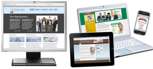
If you’re in business, you need a web presence. It’s a way for your business to be available 24 hours a day. Prospective clients can find out what you offer, how to reach you, when you’re open, where you’re located, etc. Even if it’s just a single page, you need to be online.
One of the biggest stumbling blocks to an effective website is that just about everyone out there has a friend or cousin who claims to be a web designer. Just because they’ve got some software that helps them build a site doesn’t mean they know the first thing about good design, reader-friendly writing, and search engine optimization (SEO). If you want a successful website, hire a professional designer. Remember the old adage… you get what you pay for.
Another problem I’ve seen is clients opting for template sites. By that, I mean the various web companies that offer online tools to build your own site. You choose from one of their templates and can do a basic amount of customization. These companies often charge a rather hefty monthly fee and you’re left to do the work. Plus you’ve got a site that may look just like a competitor’s. A much better solutions is to have custom built website that’s just as unique as your business. It doesn’t have to be expensive — I specialize in budget-friendly web design.
Once you have your website up and running, it’s time to tie it to the various social media platforms. For instance, if you market to consumers, Facebook and Twitter are great additions. YouTube provides a great place to store videos that educate clients and prospective clients.
Read more about good web design here.
Sticky post
All businesses need a logo. Ideally, a logo illustrates your product, service, or business name (think Apple Computer’s logo). Please don’t make the mistake of using a piece of generic clip art for your logo. Think about it… a competitor could have chosen the same image. Your logo needs to be as unique as your business.
Your logo should work at all sizes, from a business card all the way up to billboards and building signage. That means two important things: First, don’t make your logo overly detailed. When you shrink it down to the size typically used on a business card, all that detail may be lost. Second, your logo absolutely must be in a vector graphic format, so it can be enlarged without any degradation. Graphic images come in two basic types: bitmap (made up of individual “bits” or pixels) and vector (made up of mathematical equations). Too many times a client has provided me with their logo, but in bitmap format because that’s all they have. When you try to enlarge this type of image, you get that jagged “stair step” effect around any curves. That’s because all you’re doing is making the individual “bits” larger. I always provide clients with both bitmap and vector versions of their final logo. This way they have whatever they need for future marketing material.
When working out the colors, your logo should be clear whether rendered in a single color, say via fax, or in full color. I always start out the logo design process working in black and white. That way I know it will hold up if reproduced with a single ink color. Once the design itself is finalized, then I work on colors. An important consideration here is budget. I recommend logos be kept to two ink colors (yes, black is an ink color). This will keep a client’s expenses low when they need to print business stationery, but looks more professional than a one color logo. Occasionally I’ve had a client who insisted on a higher-color logo. I just make sure they understand what that will mean when they need to print anything with their logo.
Read more about some of the logos I’ve designed here.
![]()
A few of the Font Art pieces I’ve created over the years…
I’ve had a passion for the written word for as long as I can remember. I love the elegance of letterforms and calligraphy. With the advent of desktop computers, I channeled that passion into typefaces, collecting more than I can count over the years. This passion dovetails nicely with two others — my love of art and writing — and led me to create what I called Font Art. Many years ago, I discovered a usenet group called alt.binaries.fonts (a.b.f.) and many others who shared my passions. Members of the group were creating similar pieces of art, but they called them Font Plays. Members would post their creations to the group for critique and comment. My life eventually got too busy and I quit regularly participating with the group, but my passion never left.
During those years, I created an online alter ego, Fontzilla. It was my way of contributing to the world of type. While most of my time is spent creating artwork for clients, I do still like to whip up some Font Art now and then, posting them on the Fontzilla site.
 What is Font Art?
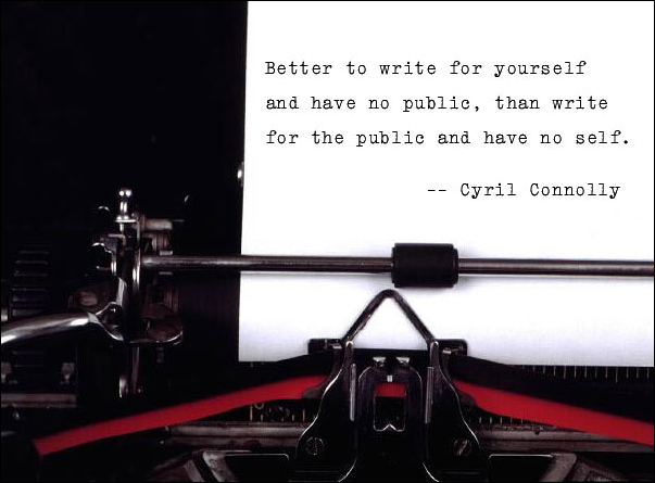
Font Art involves crafting the perfect union of words, typeface, and image. There are times when I come across a stock photo begging to be turned into a piece of Font Art, like the one you see here. That blank page was screaming for some text. I found a terrific quote and set it in just the right typeface, one that mimics a typewriter’s print. (Click on the thumbnail to see a larger version.)
There are other times when the quote drives the image selection. For instance, I did a whole series of Font Art pieces using humorous quotes from movies. The game on a.b.f. was for others to guess what the movie was and it was a lot of fun. There have been plenty of other pieces where the text inspired the image. In many of those cases, I needed to give Photoshop a bit of a workout as finding the exact image I want can be difficult. Often I just needed to manipulate a single image, others involved combining different images or creating something from scratch.
The last piece of the puzzle is my favorite — picking the right typeface. I touched on this in my post Layout. Different faces communicate different feelings. In the above example with the typewriter, the choice was a no-brainer, but often I play with several faces until I find the one I think works best. And when you’ve got the massive collection I do, that can be a time-consuming endeavor. It begins with first narrowing down what style of typeface I want for a particular piece (serif, script, hand-drawn, retro, etc.). I organize my typefaces by style (currently 37 different categories), so that helps, but it’s still quite the process. Once I narrow down the style, I go on the hunt for the best fit, using my font management software to look at the line in prospective typefaces.
Many of the faces I have are free fonts available for download online. While that’s great for the pocketbook, those faces can have issues like poor kerning (the space between letters), no ligatures, or missing certain punctuation (like typographer quote marks, the “curly” ones). So if I end up using one of those faces, I may still have work to do, getting it just right.
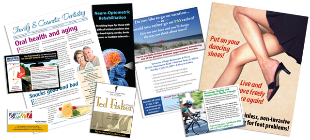
A few of the newsletters and multi-page pieces I’ve designed over the years…
While I’ve created all manner of marketing pieces over the years, my specialty by far has been newsletters. I’ve been laying them out and writing articles for clients since 1994. Newsletters are a terrific marketing tool for businesses. They provide a great way to educate customers and promote services or products. Newsletters can come in all sizes. The majority I’ve created over the years are four-page pieces — 11×17 sheets folded in half to give you the four letter-size pages. I’ve done newsletters as small as a postcard (with just a single article) to as large as over 40 pages long. Almost all the newsletters I’ve done were intended for printing, but I’ve also done my share of digital newsletters (PDFs and email newsletters). In a related note, I’ve also typeset entire books and created eBooks for a publishing company. Here are some tips to help you with your newsletter.
Your newsletter needs a name, preferably something other than just your company name. Ideally, that name should be short and sweet — think about magazine names. Giving your newsletter a name elevates its importance and it gives you something to call it. You can say to your customers, “Did you read the latest Pets’ Press?” instead of, “Did you read our latest newsletter?”
If you’re doing a print version of your newsletter, opt for at least two colors (black so photos look nice and an accent color for punch). I’ve done one-color newsletters for clients, but they tend to look cheap. Better still is a full-color newsletter, but this, too, can be dicey for some markets. If your clientele tend to be middle-class or lower, a full-color newsletter can subtly communicate your product or service is too expensive for them.
With more and more people living in the digital world, eNewsletters are becoming more popular. With this format you’re free to go full color with no worries. The main pitfall to avoid with an eNewsletter is making it too long. Reading on a digital device is not as easy on the eyes as print, so keep things short — one or two short articles is sufficient. You can make up for the shorter length with more frequent “mailings” — sending them monthly instead of quarterly, for instance.
With print newsletters, I prefer to start two or three articles on the front page, and use jumps to continue them to other pages. Think about your local newspaper — you’ll probably find they do the same thing. Doing this allows you more opportunities to grab their attention on the front page, and as they turn to inner pages to see the balance of an article, they’re exposed to other parts of your newsletter as well. It encourages them to read the whole piece.
Speaking of encouraging reading, if you do a two to four page newsletter, consider doing something like a misspelled word contest, with the first five readers to correctly report the word winning some small prize. People will read everything trying to find your misspelled word.
If you’re doing a longer newsletter, include a table of contents. It will make it easier for your readers to go straight to the articles they’re most interested in reading first.
As I mentioned in my post on Writing, make sure your articles are reader friendly. Don’t talk over your readers’ heads with 50 cent words or technical terminology they probably don’t know. Keep in mind the Average Joe only reads at about an eighth grade level. It’s also best to write in conversational English versus a more formal style.
Remember to incorporate plenty of white space and illustrations in your newsletter. I touched on this point in my post on Layout and on my Design Philosophy page. When your page is too dense, your reader may decide they don’t have time to read it and just put it down, or worse, throw it away. With newsletters, besides using margins and spacing between articles, you can also “lighten” your pages with extra leading (the space between lines of text). The default setting for leading in many software packages is often tighter than you want. Widen it up a bit, but not so much that it looks like a whole blank line.
I talked about the value of illustrations in my post Illustration, so be sure to read that. Illustrations not only help drive home the point of your article, but they also serve to grab and direct the attention of your reader. What you don’t want to do, though, is just grab a hodge podge of clip art. Doing so makes your piece look amateurish.
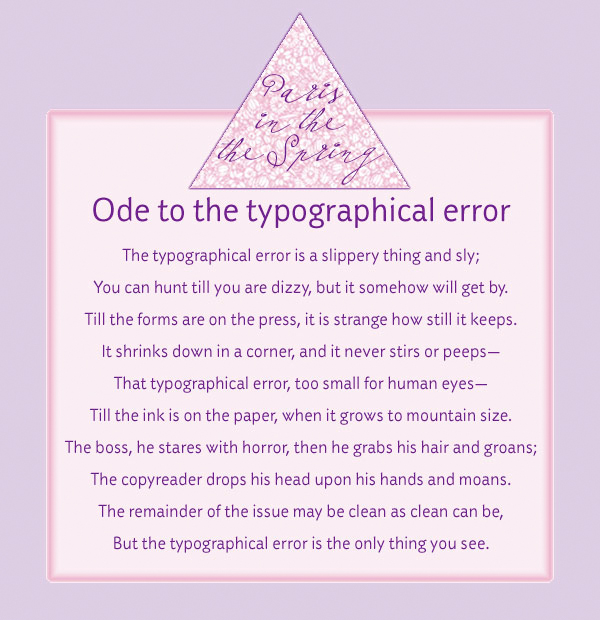
I love this poem (click on the thumbnail for a larger version). Did you catch the purposeful typo in the piece? Read it all carefully.
With shorter newsletters, you don’t need running headers or footers (repeating elements at either the top or bottom of pages), but longer newsletters and magazines do. This is where you want, minimally, a page number, but you can also include the publication name and date of issue there as well.
If your newsletter has both regular columns and unique features in each issue, consider using a different style so they stand apart. For instance, perhaps you always set column headlines in a heavy serif face, while you use a sans serif for feature article headlines. Here’s where a style book comes in handy.
A style book is a listing of how you style your publication. This helps you stay consistent throughout the piece as well as with successive issues. For instance, you lay out what typeface, point size, and color to use for various applications (body text, headlines, subheads, pull quotes, bullet points, etc.). You can also specify things like whether and how you use abbreviations, job and degree titles as well as punctuation and grammar rules. Having a style book will make your life a whole lot easier.
Proofreading is a must! That’s true for everything you create, but especially text-heavy pieces like a newsletter. And don’t forget to proof short pieces of text like headlines, jump lines, and photo captions. It’s easy to overlook those things.
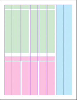
Example of how you might use an eight column layout.
Watch your line length. There’s a reason why newspapers and magazines use multi-column formats. With shorter lines of text, it’s easy for the eye to stay on track. The longer the line of text, the greater the likelihood your reader will lose their place. With the typical letter-size page, use at least two columns with a generous galley in between.
For a more interesting publication, consider doing a six to eight column format. No, that doesn’t actually mean there are six to eight columns of text; it just means a more flexible layout grid as I show in the illustration at right. I can vary how many columns each article requires, providing some contrast and interest to the overall look of the piece. While in this example there’s actually an eight-column grid, the first article (denoted by the blocks of green) uses two columns of text, the second (in pink) uses three columns, and the third (in blue) has a single column.
Because I’m a firm believer in white space, I prefer to use block style when creating my newsletters versus indented style. Way back when, everything was done indented style. This is where each paragraph’s first sentence is indented and there’s no extra space between paragraphs. These days, block style is more popular. With block style, you don’t indent that opening line, but you do insert extra space between paragraphs. That extra space helps lighten up the look of the piece. If you decide to do indented style, just remember that you don’t normally indent the first paragraph following a headline or subhead.
If you’re a business owner wanting to do a newsletter, your best bet is to hire a professional. Putting out an amateurish newsletter won’t necessarily create the impression you want. If you do decide to do your own, please don’t do it in software like Microsoft Word or Publisher. Make the investment in a professional package. I prefer Adobe InDesign, but there’s also Quark.
 A word about music or other sounds autoplaying on a website… Don’t! This was all the rage a while back and there are still sites doing it. Autoplaying music is less common today, but replacing it has been video and virtual assistants suddenly talking to you. While it can certainly get a visitor’s attention, it may very well irritate him in the process. Maybe he was streaming an online radio station while he surfed the web and you just interrupted his favorite song. Or in the case of autoplaying music, perhaps your visitors don’t share your taste in tunes.
What’s worse, I’ve been to sites doing this, but not offering an obvious way to turn it off. Very frustrating and can certainly lead to people leaving your site in droves.
If you really want to incorporate this type of gimmick (yes, that’s what it is) on your site, at least do visitors the courtesy of setting it to “off” with a clear way for them to turn it “on” if they’re interested in it.
 You could take all the art, design, and marketing classes available, but you can’t beat the education to be had working for a marketing research firm. Many years ago I had the good fortune of working for one, conducting face-to-face surveys, phone surveys, and focus groups. We tested both marketing campaigns and products. It was a very enlightening experience that greatly contributed to my design philosophy.
One particular survey I worked on provides a fantastic illustration of one of the most important lessons I learned there. We were surveying a print ad for a particular brand of champagne. We created a book of numerous full page ads, and in and amongst them was our client’s ad. Conducted individually, we had survey participants flip through the book. When they were done, participants were asked about what ads they remembered, whether they knew what product was being promoted, etc. It was amazing how many people didn’t remember some ads at all. More interesting was that, for many of the ads they did remember, they couldn’t tell me the product. Our client’s ad suffered this phenomenon. People remembered the ad — it was definitely eye catching — but many didn’t have a clue what it was actually advertising. Would you consider that a successful ad? I certainly don’t.
The point is you can make an amazing piece of art that design professionals ooh and ahh over, but if it doesn’t sell the client’s product or service, it was a waste of their money. Sure, you the designer may earn awards for your art, but you did a huge disservice to your client. Remember a design professional’s true purpose — to help his client, not earn awards from his peers.
Television commercials are often guilty of this same phenomenon. The Monday after a Super Bowl may have people talking about the very expensive commercials run during the game, but how many of those commercials will generate business for the companies running them? I think one of the worst from the 2012 game has to be the Toyota Camry “Reinvent” ad. Really? Curtains made of pizza? A baby that doesn’t poop and is also a time machine? What were these guys smoking when they came up with this concept? Some amusing images, but it didn’t tell how the car was reinvented or convince you to buy one.
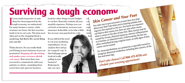
You owe it to your client produce an effective marketing piece. That’s what he’s paying for after all. Of course, sometimes the client is his own worst enemy, refusing to take your advice on what would be most effective. Here’s another example from an old employer of mine, shortly before I chose to go out on my own. The company was taking out a full page ad in a magazine that was pretty text-heavy (it was geared to librarians). I tried to talk the owners into doing a very minimal ad — still a full page, but with just a short paragraph and logo floating in a sea of white space. With such a text-heavy magazine it would definitely grab the reader’s attention and that’s the first job of an ad. The short message would have been enough to tease and get prospective customers to reach for more information which is what we wanted. But the owners’ response was that they’re paying for a full page so they wanted it packed full. Worse, they wanted the ad mocked up to look like the articles in the magazine. I tried my best to convince them it wouldn’t be as effective, but to no avail. I had to create the artwork they wanted. And no, we didn’t get much response from that ad.
© 2024 design
Theme by Anders Noren — Up ↑