A few of the Font Art pieces I’ve created over the years…
I’ve had a passion for the written word for as long as I can remember. I love the elegance of letterforms and calligraphy. With the advent of desktop computers, I channeled that passion into typefaces, collecting more than I can count over the years. This passion dovetails nicely with two others — my love of art and writing — and led me to create what I called Font Art. Many years ago, I discovered a usenet group called alt.binaries.fonts (a.b.f.) and many others who shared my passions. Members of the group were creating similar pieces of art, but they called them Font Plays. Members would post their creations to the group for critique and comment. My life eventually got too busy and I quit regularly participating with the group, but my passion never left.
During those years, I created an online alter ego, Fontzilla. It was my way of contributing to the world of type. While most of my time is spent creating artwork for clients, I do still like to whip up some Font Art now and then, posting them on the Fontzilla site.
 What is Font Art?
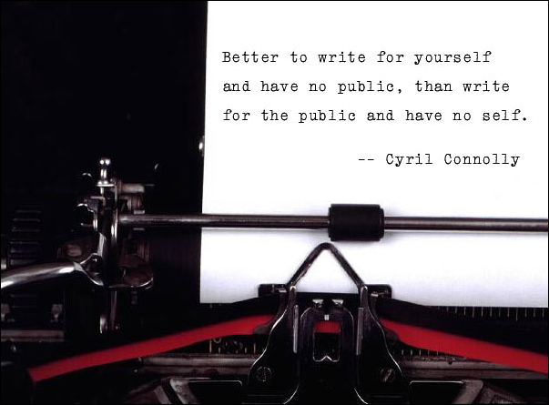
Font Art involves crafting the perfect union of words, typeface, and image. There are times when I come across a stock photo begging to be turned into a piece of Font Art, like the one you see here. That blank page was screaming for some text. I found a terrific quote and set it in just the right typeface, one that mimics a typewriter’s print. (Click on the thumbnail to see a larger version.)
There are other times when the quote drives the image selection. For instance, I did a whole series of Font Art pieces using humorous quotes from movies. The game on a.b.f. was for others to guess what the movie was and it was a lot of fun. There have been plenty of other pieces where the text inspired the image. In many of those cases, I needed to give Photoshop a bit of a workout as finding the exact image I want can be difficult. Often I just needed to manipulate a single image, others involved combining different images or creating something from scratch.
The last piece of the puzzle is my favorite — picking the right typeface. I touched on this in my post Layout. Different faces communicate different feelings. In the above example with the typewriter, the choice was a no-brainer, but often I play with several faces until I find the one I think works best. And when you’ve got the massive collection I do, that can be a time-consuming endeavor. It begins with first narrowing down what style of typeface I want for a particular piece (serif, script, hand-drawn, retro, etc.). I organize my typefaces by style (currently 37 different categories), so that helps, but it’s still quite the process. Once I narrow down the style, I go on the hunt for the best fit, using my font management software to look at the line in prospective typefaces.
Many of the faces I have are free fonts available for download online. While that’s great for the pocketbook, those faces can have issues like poor kerning (the space between letters), no ligatures, or missing certain punctuation (like typographer quote marks, the “curly” ones). So if I end up using one of those faces, I may still have work to do, getting it just right.