A few of the newsletters and multi-page pieces I’ve designed over the years…
While I’ve created all manner of marketing pieces over the years, my specialty by far has been newsletters. I’ve been laying them out and writing articles for clients since 1994. Newsletters are a terrific marketing tool for businesses. They provide a great way to educate customers and promote services or products. Newsletters can come in all sizes. The majority I’ve created over the years are four-page pieces — 11×17 sheets folded in half to give you the four letter-size pages. I’ve done newsletters as small as a postcard (with just a single article) to as large as over 40 pages long. Almost all the newsletters I’ve done were intended for printing, but I’ve also done my share of digital newsletters (PDFs and email newsletters). In a related note, I’ve also typeset entire books and created eBooks for a publishing company. Here are some tips to help you with your newsletter.
Your newsletter needs a name, preferably something other than just your company name. Ideally, that name should be short and sweet — think about magazine names. Giving your newsletter a name elevates its importance and it gives you something to call it. You can say to your customers, “Did you read the latest Pets’ Press?” instead of, “Did you read our latest newsletter?”
If you’re doing a print version of your newsletter, opt for at least two colors (black so photos look nice and an accent color for punch). I’ve done one-color newsletters for clients, but they tend to look cheap. Better still is a full-color newsletter, but this, too, can be dicey for some markets. If your clientele tend to be middle-class or lower, a full-color newsletter can subtly communicate your product or service is too expensive for them.
With more and more people living in the digital world, eNewsletters are becoming more popular. With this format you’re free to go full color with no worries. The main pitfall to avoid with an eNewsletter is making it too long. Reading on a digital device is not as easy on the eyes as print, so keep things short — one or two short articles is sufficient. You can make up for the shorter length with more frequent “mailings” — sending them monthly instead of quarterly, for instance.
With print newsletters, I prefer to start two or three articles on the front page, and use jumps to continue them to other pages. Think about your local newspaper — you’ll probably find they do the same thing. Doing this allows you more opportunities to grab their attention on the front page, and as they turn to inner pages to see the balance of an article, they’re exposed to other parts of your newsletter as well. It encourages them to read the whole piece.
Speaking of encouraging reading, if you do a two to four page newsletter, consider doing something like a misspelled word contest, with the first five readers to correctly report the word winning some small prize. People will read everything trying to find your misspelled word.
If you’re doing a longer newsletter, include a table of contents. It will make it easier for your readers to go straight to the articles they’re most interested in reading first.
As I mentioned in my post on Writing, make sure your articles are reader friendly. Don’t talk over your readers’ heads with 50 cent words or technical terminology they probably don’t know. Keep in mind the Average Joe only reads at about an eighth grade level. It’s also best to write in conversational English versus a more formal style.
Remember to incorporate plenty of white space and illustrations in your newsletter. I touched on this point in my post on Layout and on my Design Philosophy page. When your page is too dense, your reader may decide they don’t have time to read it and just put it down, or worse, throw it away. With newsletters, besides using margins and spacing between articles, you can also “lighten” your pages with extra leading (the space between lines of text). The default setting for leading in many software packages is often tighter than you want. Widen it up a bit, but not so much that it looks like a whole blank line.
I talked about the value of illustrations in my post Illustration, so be sure to read that. Illustrations not only help drive home the point of your article, but they also serve to grab and direct the attention of your reader. What you don’t want to do, though, is just grab a hodge podge of clip art. Doing so makes your piece look amateurish.
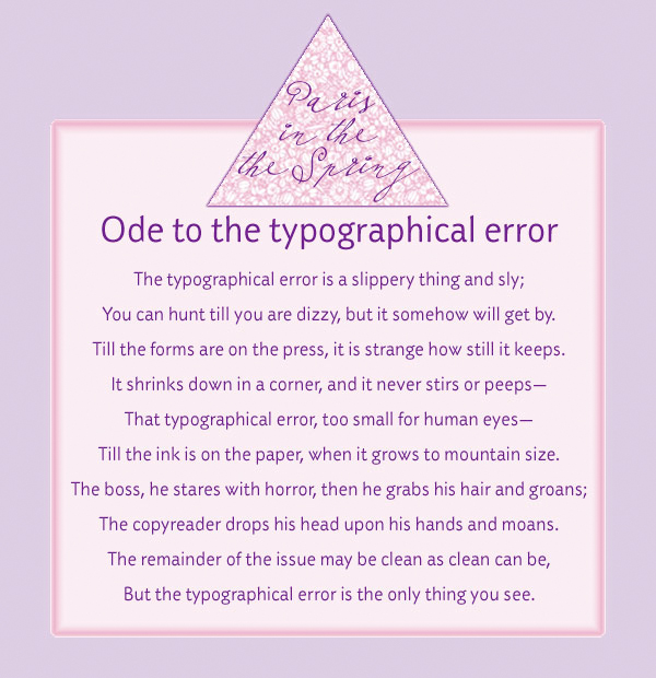
I love this poem (click on the thumbnail for a larger version). Did you catch the purposeful typo in the piece? Read it all carefully.
With shorter newsletters, you don’t need running headers or footers (repeating elements at either the top or bottom of pages), but longer newsletters and magazines do. This is where you want, minimally, a page number, but you can also include the publication name and date of issue there as well.
If your newsletter has both regular columns and unique features in each issue, consider using a different style so they stand apart. For instance, perhaps you always set column headlines in a heavy serif face, while you use a sans serif for feature article headlines. Here’s where a style book comes in handy.
A style book is a listing of how you style your publication. This helps you stay consistent throughout the piece as well as with successive issues. For instance, you lay out what typeface, point size, and color to use for various applications (body text, headlines, subheads, pull quotes, bullet points, etc.). You can also specify things like whether and how you use abbreviations, job and degree titles as well as punctuation and grammar rules. Having a style book will make your life a whole lot easier.
Proofreading is a must! That’s true for everything you create, but especially text-heavy pieces like a newsletter. And don’t forget to proof short pieces of text like headlines, jump lines, and photo captions. It’s easy to overlook those things.
Example of how you might use an eight column layout.
Watch your line length. There’s a reason why newspapers and magazines use multi-column formats. With shorter lines of text, it’s easy for the eye to stay on track. The longer the line of text, the greater the likelihood your reader will lose their place. With the typical letter-size page, use at least two columns with a generous galley in between.
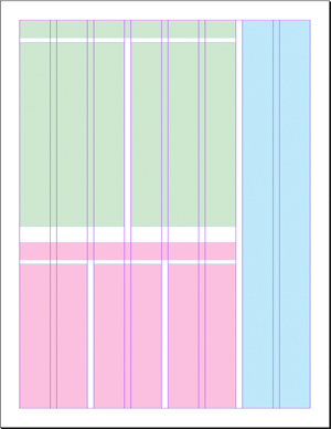
For a more interesting publication, consider doing a six to eight column format. No, that doesn’t actually mean there are six to eight columns of text; it just means a more flexible layout grid as I show in the illustration at right. I can vary how many columns each article requires, providing some contrast and interest to the overall look of the piece. While in this example there’s actually an eight-column grid, the first article (denoted by the blocks of green) uses two columns of text, the second (in pink) uses three columns, and the third (in blue) has a single column.
Because I’m a firm believer in white space, I prefer to use block style when creating my newsletters versus indented style. Way back when, everything was done indented style. This is where each paragraph’s first sentence is indented and there’s no extra space between paragraphs. These days, block style is more popular. With block style, you don’t indent that opening line, but you do insert extra space between paragraphs. That extra space helps lighten up the look of the piece. If you decide to do indented style, just remember that you don’t normally indent the first paragraph following a headline or subhead.
If you’re a business owner wanting to do a newsletter, your best bet is to hire a professional. Putting out an amateurish newsletter won’t necessarily create the impression you want. If you do decide to do your own, please don’t do it in software like Microsoft Word or Publisher. Make the investment in a professional package. I prefer Adobe InDesign, but there’s also Quark.