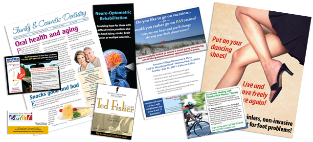
Good layout combines quality writing and ideal illustrations into a great marriage, producing effective marketing pieces. Whether you need something as simple as a business card or office brochure, all the way to full newsletters and magazines, layout is king.
You should be sure your finished layout provides a good balance of content to white space. One of the biggest problems I’ve seen clients make is trying to pack too much into their piece, leaving no breathing room or place for the eye to rest. When a piece is too “dense”, it can cause the reader to not even try.
Illustrations are key to a good layout. The eye is drawn to a photo or illustration before it sees text. When you place an appropriate piece of artwork with your text, you grab and direct the reader’s attention.
Part of the layout process includes selecting just the right typefaces to help reinforce your message. Different faces communicate different feelings. For instance, a bank or law office may prefer a stately serif face like the classic Kennerly, by the great designer Frederic Goudy, while a spa catering to women would do better with the feminine lines of Lynotype’s Zapfino.
When creating text heavy pieces like newsletters, consider using two contrasting typefaces — one for the body copy and the other for headlines and subheads. For instance, since serif faces are easier on the eyes, use a serif for the body and a complimentary sans serif for the headlines and subheads. Just whatever you use, keep the number of different typefaces to an absolute minimum.